Gaby is a Creative Strategist at StackAdapt who loves using visual design to understand and learn how to develop innovative new creative strategies.
Visual hierarchy is important to capture user attention and guide them visually through the elements of your ad. For digital ads, the message needs to be delivered as quickly and effectively as possible—because attention spans are short—making visual hierarchy very important to online advertising. To make an ad engaging, present the elements in a way that tells a story. This means giving a different level of importance to each one of your creative elements. The goal is to guide a user through all the information you want to give them and, eventually, interact with your ad in some way.
Let’s take a look at banner ads and how you can achieve this. There are several important considerations when creating a static banner ad:
- What problem is the product/service advertised solving?
- What is going to bring people’s attention to the ad and make them interact with it?
- How do you get your information across in an easily digestible way?
The answer to these questions depends on a multitude of variables—you need to consider your goals, your audience, and messaging to streamline the process of building your campaigns. Have all the information you need at the ready before jumping into ad creation. If your strategy has a clear direction, it will be reflected in the ads you make—and will help users better understand your intended message.
What to Consider
Here are just some of the things to keep in mind when looking at advertising design and visual hierarchy:
Reading Patterns
Generally, people read text from the top left to right, and then bottom left to right—in a “Z” pattern. Having a strong headline at the top is a common way to captivate the user into exploring more of the information contained in your ad.
Size of Text
People read text that is bigger first. It is interesting to note that this can override normal reading patterns. If you want to easily attract the attention of a user, big and bold text works well.
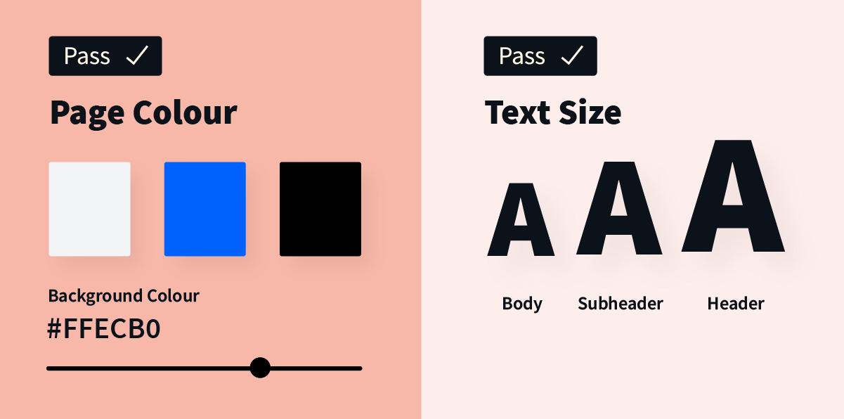
White Space
White space is used to give more importance to certain elements. This creates contrast with other information on the ad, attracting the eye to whichever area you wish to feature.
Colour
Bright colours tend to make an ad stand out. You can use colour to create contrast and emphasize certain details. A common use of colour in ads is making the CTA button pop out with a bright colour choice.
How to Execute
Let’s take a look at an example of an effective visual hierarchy that uses the previously mentioned concepts.
Example
Goal: Engagement
Product/Service: Clothing
Here is what the ad might look like without any visual hierarchy in place:

The user is likely going to read the ad from left to right, and top to bottom. So although you will first have them read the brand’s logo, you may have lost their attention before they get to the line about 25% off or even see the image of the model showcasing the clothing. You don’t want to risk them falling off before clicking through to learn more.
You actually want them to be looking at the content in the following order:
1 – Image
2 – Tagline (Value Proposition)
3 – Logo
4 – Additional information
5 – CTA
Leveraging the appropriate visual hierarchy and tips mentioned above, you could use different text sizes and white space to your advantage to have the ad look like this:
If you break it down, we have arranged the ad so that the user’s eye moves in the correct order:

In this example, we see that by using concepts such as contrast, white space, and text size, the user is easily guided through the specific message the ad is intended to convey. Creating a story helps minimize the effort required for a user to comprehend your message.
You want to build a clear distinction between elements in your static banner ads through visual hierarchy. In advertising, it’s important to always try different tactics and constantly find ways to innovate. Don’t be scared to test things out—that’s how you’ll evolve your visual strategies to the next level.
Want to run exceptional programmatic campaigns? Request a demo to learn more about StackAdapt.