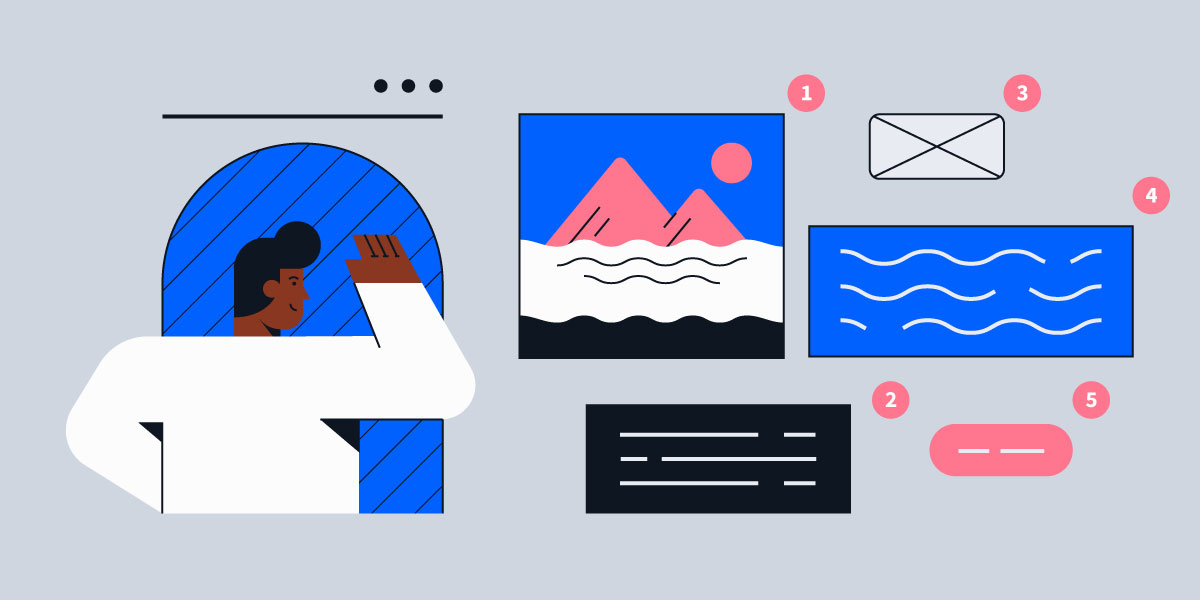
As marketers we want attention. We try to craft and phrase the perfect headline that will pique a reader’s interest, and then labor over clever copy that engages, entertains and educates. But when it comes to our visual content, a lot of us struggle, become frustrated, and end up going with an image that doesn’t measure up to our copy.
When studying user attention, consider the popularity of Facebook, Instagram, YouTube, and Snapchat. You will quickly realize that visual based social media dominates the landscape. Even before our audience looks at our headline, the image is what captivates them.
Are you confident in your ability to choose an impactful image that will compel a reader? Let’s look at how to get the results you want by choosing the perfect photo for your native ads.
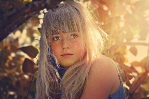
1. Use a human!

Increase your chances immediately by using a human in your creative. You may think an article about high powered race cars demands a great picture of a German engineered automobile, but readers are more likely to respond to someone they can relate to enjoying the car. People react to other people more than they do to inanimate objects. Need proof? Next time you’re on Instagram, take a look at a popular model. Look at the number of likes and comments their selfies get, and then compare it with a post of a quote, or an inanimate object. The difference is staggering.
*The above is a captivating example of a native ad using a human.
2. It’s all in the eyes.
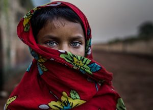
Eyes telegraph a broad range of emotions. Be it joy, sadness, surprise, embarrassment, every emotion can be expressed through our eyes. They also connect. You can hear it in a person’s voice; see it in their body, but you will know it in their eyes. Eyes have an unparalleled way of communicating. We’ve heard it before “eyes are the windows to the soul,” and it’s true. Don’t market without a soul; give your campaign personality, life and truth.
3. Composition, Colour, Light
We’re not asking you to become photographers, but having a grasp of the basic elements in an image will put you leaps and bounds above less knowledgeable media professionals.
Composition:

How the picture is framed. Where the subject lies in a photograph has a strong impact on the message of the photo. Are they walking away, or coming towards? Are they small in a big room, or big in a small room? These considerations will have a strong bearing on your message.
There are also practical things to consider. If you plan on putting text over an image, it’s best to make sure there is space to write over. Nothing distracts from your message more than text that is difficult to read. If your text runs over the busy part of an image, you’ll do just that. Look at the image balance. Here’s a great article by the folks at Nokia on composition rules. Conversely, this post by National Geographic discusses breaking the rules of photography.
Colour:
Colour is the first thing we notice and has a significant effect on viewer reaction. We’ve all covered the effect of colour in advertising in our marketing courses (or learned quickly on the job!), but how well do we apply it in our articles and native advertisements?
Did you know that reactions to colour vary based on culture and even gender? For example, orange is the most sacred colour in Hindu religion and black can sometimes have a negative connotation associated with it, which is why we see campaigns for Drug Free America and Mothers Against Drunk Driving with a strong black presence, to reinforce the negative feelings associated with those colours.
Light:
You may think of light as a very technical consideration, better mulled over by photographers, but you’d be wrong. Light is critical to setting a mood. It also directs your eyes to a part of an image and adds style. We see things we otherwise wouldn’t when we vary our light. That’s why we always try to see things in a new light.
4. Who is your audience?
Would your grandma get it?
Determining the right audience is the first step in all of our marketing strategies, and it’s a very important factor in choosing an image. When we know who our audience is, we can choose images that resonate with them. I’ve seen advertising campaigns aimed at an older demographic that used funny memes with Bad Luck Brian. While the copy was humorous, the advertisers made the assumption that the 35-50+ demo browsed reddit and imgur looking for funny pictures. Know your audience! Imagine what they look like. Imagine their age, their style, marital status, occupation, and even race. The more the user feels like the article is about them, the more likely they are to read on.
5. Go with your Gut!

While the technology to choose images based on their efficacy is emerging, there are reactions and emotions that AI hasn’t figured out yet. That’s where humans come in. What is your immediate reaction to the image? Does the image represent your article? Is the image engaging, and does it draw in readers? How you react to an image the first time you see it is probably how other people, in the same conversation you’re creating, will see it as well. There’s no metric for a first impression, so let it be a strong consideration.
Conclusion
Make choosing your image fun. Consider the above guidelines, expand your knowledge of photography, and gain an edge in the busy world of paid media. You have the power to choose effective and compelling images for your next native ad campaign, and doing so with certainly will help you achieve the results your content deserves. Happy browsing!